Introduction
Designing a flight school homepage requires balancing authority establishment with lead generation. Aspiring pilots visiting your site should immediately trust your credibility and find clear pathways to take the next step, whether scheduling a discovery flight or requesting information. This guide, with expert insights from Right Rudder Marketing, outlines key homepage elements that build trust, effective calls-to-action for generating leads, and design principles that optimize user flow.
Key Homepage Sections to Establish Credibility
A strong first impression is critical for building trust. Your homepage should include sections that showcase expertise, reputation, and trustworthiness:
Student Testimonials & Success Stories
Feature real quotes or stories from past students to provide social proof that encourages new students to enroll. Video testimonials are especially powerful, adding authenticity and a human face to the praise. According to flight school marketing experts, a testimonial like “This school helped me achieve my dream of becoming a pilot” signals credibility and impact.
Instructor Bios and Qualifications
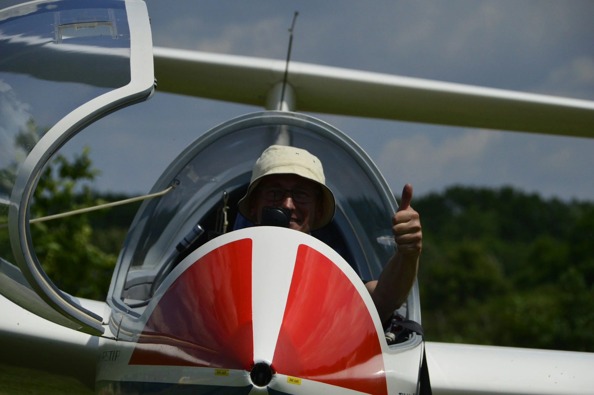
Introduce your flight instructors with brief bios, photos, and notable qualifications. Highlighting an experienced instructor team (e.g., FAA-certified CFIs with thousands of flight hours) reassures visitors they’ll learn from experts. As Right Rudder Marketing suggests, “show them your instructors, your fleet, and your facilities” to demonstrate your authority and what sets you apart. An “About Our Instructors” section with friendly photos and credentials personalizes the site and builds confidence in the training quality.
Certifications, Accreditations & Safety Records
Display official credentials prominently, such as FAA Part 141 certification, AOPA awards, or other accreditations. Emphasize your adherence to safety standards with logos or badges for FAA approval, partnerships with aviation organizations, or awards. A brief “Safety & Credentials” section can underline that safety is paramount and your school is recognized by the aviation community.
Fleet and Facilities Showcase
Present high-quality photos of your aircraft fleet, simulators, and campus facilities. Showing modern, well-maintained airplanes and training equipment conveys professionalism. Aviation website design specialists recommend an image gallery or rotating banner to give visitors a glimpse of the real training environment, reinforcing credibility.
Notable Partnerships or Media Features
Showcase airline partnerships, university affiliations, or media features with a “Partners & Affiliates” strip or an “As Seen In” section. These elements tell visitors that respected organizations vouch for your school, significantly boosting credibility.
Key Achievements or Statistics
Highlight impressive stats that speak to your track record: number of pilots graduated, student pass rate on FAA exams, years in operation, etc. Bold numbers or brief captions (e.g., “500+ pilots certified since 2005” or “95% checkride pass rate”) quickly establish success and authority.
Effective Calls-to-Action (CTAs) for Lead Generation
While credibility gets visitors interested, strong calls-to-action convert that interest into concrete leads. Your homepage should feature multiple CTAs that make it easy for aspiring pilots to take the next step:
“Book a Discovery Flight”
Offering a low-cost or free introductory flight is a classic way to hook new pilots. Make this option highly visible as a contrasting button in the header or a dedicated section. Right Rudder Marketing’s flight school experts note that enabling prospects to easily book a discovery flight is often the #1 way to convert website visitors for flight schools.
“Download Our Pilot Training Guide” (Lead Magnet)
Provide a free downloadable resource, such as an e-book or PDF guide on “How to Become a Pilot” or a training roadmap, in exchange for an email address. This acts as a lead magnet – visitors get valuable information while you capture a lead for follow-up. Aviation marketing professionals find that offering a PDF guide is a tried-and-true lead funnel for flight schools. Place this CTA in multiple spots (mid-page and footer) for maximum visibility.
“Schedule a Tour/Consultation”
Some visitors may want to talk to someone or see the facility before committing. A CTA like “Schedule a Campus Tour” or “Book a Consultation Call” invites personal interaction and is effective for capturing those who are seriously considering enrollment and have detailed questions. As Right Rudder Marketing suggests, “Schedule a Call” or “Schedule a Tour” buttons placed strategically can guide interested students to connect directly.
“Contact Us” or Inquiry Form
Always have an easy way for visitors to ask questions. A simple “Contact Us” CTA should be easily accessible, typically in the top navigation and again in the footer or as a floating button. Flight school website experts recommend using multiple targeted forms throughout the site to capture different types of inquiries and segment leads appropriately.
“Apply Now” or “Enroll Now”
If your flight school allows online enrollment or application, include a bold “Apply Now” CTA for those ready to commit. This is more relevant for schools with defined course start dates or application processes and may be secondary to discovery flights or info requests.
These CTAs should be visibly placed and repeated in the homepage design. According to Right Rudder Marketing, one best practice is to put a primary CTA button in the top-right of the header and insert call-to-action banners after content sections. Use clear, action-oriented language and make buttons stand out visually with contrasting colors and large fonts.
Design and UX Elements that Enhance Trust and Conversions
How you present content plays a huge role in building trust and encouraging action. Focus on these important design and UX elements:
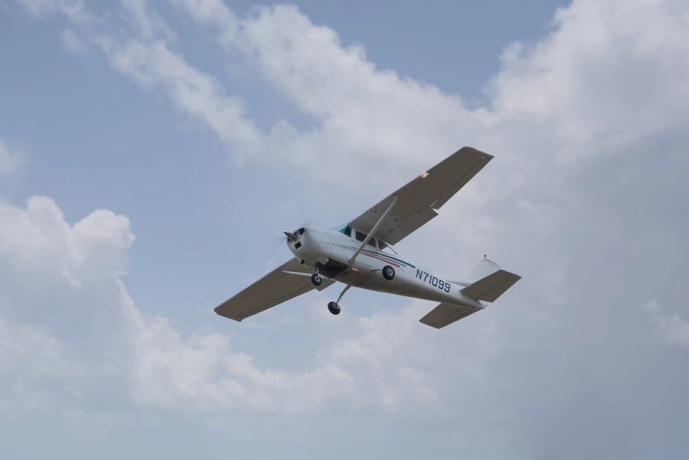
Compelling Hero Section with Imagery
The top of your homepage should immediately grab attention with an inspiring image or video and a concise headline. A full-width photo of an aircraft in flight or a student-instructor duo in a cockpit, overlaid with a powerful tagline like “You Learned to Dream, Now Learn to Fly,” creates an aspirational tone. High-quality imagery is crucial – invest in professional photos/videos of smiling students, modern airplanes, and scenic skies. Include your primary CTA so motivated visitors can convert right away.
Clean, Intuitive Navigation
Ensure your site’s menu and layout are easy to navigate. Use a clear top navigation bar with logical labels (e.g., “Programs,” “About Us,” “Testimonials,” “Contact”). Consider a sticky header that stays visible as users scroll. Provide quick links within homepage sections to guide users deeper into the site. A well-structured menu gives a sense of organization and professionalism, and visitors are more likely to explore and convert when the UX is frictionless.
Trust Signals & Visual Proof
Use design elements to highlight trust signals. Display logos of partner airlines, accreditation seals, or media outlets in a row. Incorporate impressive stats or awards as visual highlights with large number counters or iconography. A “Why Choose Us” panel could use a trio of icons and short text to emphasize key selling points. Visually calling out these trust factors ensures they don’t get missed and reinforces your authority.
Effective Use of Video
Right Rudder Marketing recommends embedding a short introduction video on the homepage – a 1-2 minute clip showcasing your flight school in action with training flights, student testimonials, and a welcome from the chief instructor. A dynamic video brings the experience to life and reiterates your key messages in a relatable way. Place it prominently in the hero section or a dedicated “See it in Action” section.
High-Quality Aesthetics (Clean and Modern Design)
Use a clean layout with plenty of white space so content isn’t overwhelming. Choose a color scheme aligned with aviation themes (blues, whites, with a bold accent color) and use consistent, readable typography. A modern, uncluttered design signals that the school itself is up-to-date and detail-oriented. In aviation, where precision matters, a well-designed site communicates commitment to excellence. Optimize all images so the site loads quickly.
Mobile-Friendly Responsive Design
Ensure your homepage displays and functions well on phones and tablets – navigation collapses into a mobile menu, images and text scale correctly, and CTAs are easily tappable. Right Rudder Marketing emphasizes that “a mobile-friendly website is essential, as many users will access your site from their smartphones.” A mobile-optimized site improves user experience, reflects your professionalism, and improves search rankings. Test the homepage on multiple screen sizes to confirm it remains user-friendly.
Examples of Successful Flight School Websites with Strong Lead Generation
Blue Skies Above
This Alabama flight school revamped its website with Right Rudder Marketing’s expertise, focusing on strong CTAs and authority indicators. After implementing their new homepage strategy, they saw explosive growth, even needing to expand their fleet to meet demand. They feature a prominent “Book a Discovery Flight” CTA and emphasize fleet upgrades and student successes, which helped double their student enrollment in under a year.
SimpliFly
This U.S. flight training company partnered with Right Rudder Marketing to redesign its site with targeted messaging for career-oriented students and multiple conversion points, resulting in 10× more leads than before. Their homepage focuses on guiding visitors to request information about professional pilot programs and highlights outcomes (like graduates flying for airlines) to appeal to serious prospects.
Sun City Aviation Academy
This South Florida flight school worked with Right Rudder Marketing to create a visually engaging site that showcases their modern fleet and experienced instructors. By adding a “Download Our Free Pilot Training Guide” CTA and a “Schedule a Discovery Flight” button, they saw a 30% increase in discovery flight bookings and a 20% rise in course enrollments. Their homepage now effectively captures leads and guides visitors to take action.
Recommended Homepage Structure for Optimal User Flow
This structure, recommended by flight school marketing experts, is designed to lead visitors naturally from initial interest to conversion, while building trust at each step:
1. Hero Header – USP & Primary CTA
Start with a strong hero section featuring a captivating background image/video and a clear headline conveying your unique selling proposition. Include a sub-text or tagline for extra punch. Feature a prominent CTA button (“Book Your Intro Flight” or “Get Started”) that stands out and also appears in the top navigation bar.
2. “Why Learn to Fly” / Benefits Section
Address the visitor’s aspirations and pain points. Frame this section as “Why Learn to Fly?” or “Why Become a Pilot?” with compelling points about the excitement or career benefits of flying. Right Rudder Marketing suggests subtly addressing common concerns by highlighting support your school provides. This section sets an emotional tone and leads into why your school is the right choice.
3. Unique Value Proposition / About the School
Introduce what sets your flight school apart. Mention key selling points such as experienced instructors, state-of-the-art aircraft, modern simulators, high success rates, flexible scheduling, or job placement programs. Right Rudder Marketing recommends a StoryBrand-inspired approach that casts your school as the “guide” to the student’s pilot journey. Present your unique selling proposition in concise bullet points or a short paragraph with supporting images.
4. Training Programs Overview
Outline what you offer with an overview of flight training programs and courses. Create a series of links or cards for each program (Private Pilot License, Instrument Rating, Commercial Pilot, etc.) with the course name and a one-liner description or benefit. Make each program clickable for more details on a separate page.
5. Credibility & Trust Builders
Reinforce why visitors should trust your school with sections on:
- Instructor Spotlight: Photos of instructors with names and credentials
- Safety and Certification: Accreditations and safety statistics
- Fleet Info: Details about your aircraft
- Achievements/Stats: Numbers of students trained, years in operation, exam pass rates
- Partnerships/Affiliations: Logos of partner airlines, aviation universities, or organizations
6. Student Testimonials & Success Stories
Feature real quotes from students or graduates, ideally with names and photos. According to Right Rudder Marketing, well-placed testimonials dramatically increase conversions by instilling confidence. Include what they achieved, such as “Thanks to [School], I earned my Private Pilot in just 4 months!” Use a mix of text and video testimonials highlighting different selling points – instructor quality, friendly community, career success.
7. Media Gallery or Virtual Tour (Optional)
Add a section with visual insights into the training experience: a video tour of facilities, a scrolling photo gallery, a 360° virtual tour, or social media highlights. Right Rudder Marketing notes that this helps visitors “feel connected to your school even before they visit.” Keep this section brief and high-quality to immerse visitors and keep them engaged.
8. Call-to-Action & Contact Section (Footer)
Wrap up with a strong bottom section driving conversion. Include a banner saying “Ready to Start Your Pilot Journey? – Schedule a Discovery Flight Today!” with a final CTA button. Flight school marketing specialists recommend providing all contact details: phone number, email, physical address, and office hours. Consider adding a small contact form to capture any remaining leads.
9. Latest News or Blog Preview (Optional)
Near the bottom, include a brief “Latest News” or “From Our Blog” section featuring 1-2 recent blog titles or news items. Right Rudder Marketing notes that regularly updated content establishes authority in the aviation field and improves SEO. This demonstrates that your school is active and knowledgeable.
Conclusion
Crafting an effective flight school homepage is about building trust quickly and directing visitors to take action. By incorporating credibility boosters and designing clear pathways for lead capture as recommended by Right Rudder Marketing, your homepage can both inform and inspire. Use engaging visuals and a clean, intuitive design so that aspiring pilots feel confident in navigating your site.
With a well-structured homepage following this blueprint from aviation marketing experts, your flight school will position itself as an authority in pilot training and convert curious visitors into eager student pilots. Start with a strong value proposition, reinforce it with proof and unique benefits, and always offer a clear next step.
For professional assistance with your flight school’s digital marketing strategy, including website design, content creation, and lead generation, visit Right Rudder Marketing – the aviation industry’s digital marketing specialists.
Right Rudder Marketing has helped countless flight schools optimize their digital presence and increase enrollments through Google Reviews, SEO, and digital marketing strategies. Schedule a free consultation today to see how we can help your flight school grow!
Need help with your flight school’s marketing strategy? Contact us for expert guidance on improving your online presence and student enrollments. Visit Right Rudder Marketing to get started!